
7 Retail Store Design Principles That Create a Better Shopping Experience
Good retail design isn't just about creating a beautiful store. Your space also has a job to do.
It should help customers understand where to go, make your products easy to discover and create an environment that feels distinctly like your brand. And you don't necessarily need a major renovation to improve it. Sometimes moving a fixture, adjusting your lighting or giving a crowded display more breathing room can completely change how a customer experiences the space.
If you're opening a store or wondering why your current space isn't quite working, start with these seven retail design principles.
1. Start With the Store Layout
Before choosing display tables or deciding where your newest collection will go, think about how customers will actually move through the store.
There are several approaches to retail layouts. A grid layout creates more structured aisles and works well for stores carrying a lot of inventory. A free-flow layout is less rigid and gives customers more freedom to wander and discover. Loop layouts create a more defined journey around the store.
There isn't one layout that's right for every retailer.
Think about your products, customer and how people typically shop your category. Make sure aisles feel comfortable, important areas are visible and customers can understand where to go without having to think too hard about it.
Planning a new space? Our Floor Plan Guide can help you work through your store layout before you start committing to fixtures.
2. Give Customers a Reason to Keep Exploring
A customer shouldn't be able to stand at the entrance, scan the entire store in five seconds and feel like they've already seen everything.
Create small moments of discovery throughout the space.
That might mean positioning a feature display deeper into the store, introducing an interesting product grouping around a corner or using sightlines to give customers a glimpse of what's ahead.
You don't need to force customers through a complicated maze. The idea is to create enough visual interest that there is always something inviting them to take a few more steps.
3. Use Visual Merchandising to Make Products Easier to Shop
Visual merchandising should do more than make a shelf look pretty.
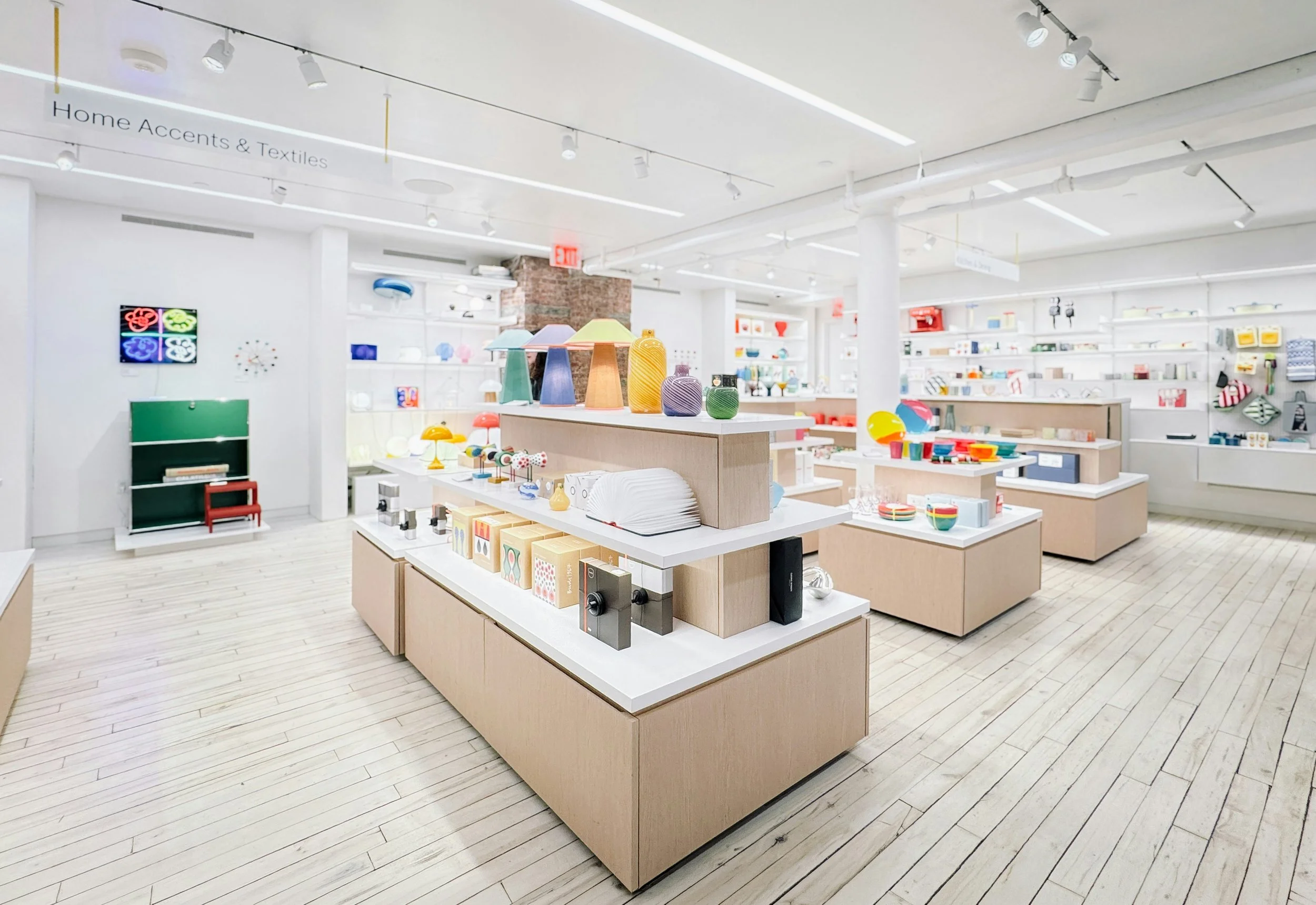
Think about what you want the customer to notice first. Give featured merchandise enough room to stand out, introduce different heights into displays and group products in ways that help customers understand how they could use them.
Cross-merchandising is one of my favourite ways to do this. Instead of keeping every product category completely separate, bring together items that make sense in the customer's life. A scarf displayed with a fragrance or a mug, for example, can turn three unrelated products into a thoughtful gifting story.
And don't feel that every inch of a fixture needs to be filled. When too many products compete for attention, sometimes the best thing you can add to a display is a little empty space.
Our Display Layout Guide goes deeper into setting up and refining displays throughout your store.
4. Use Lighting to Direct Attention
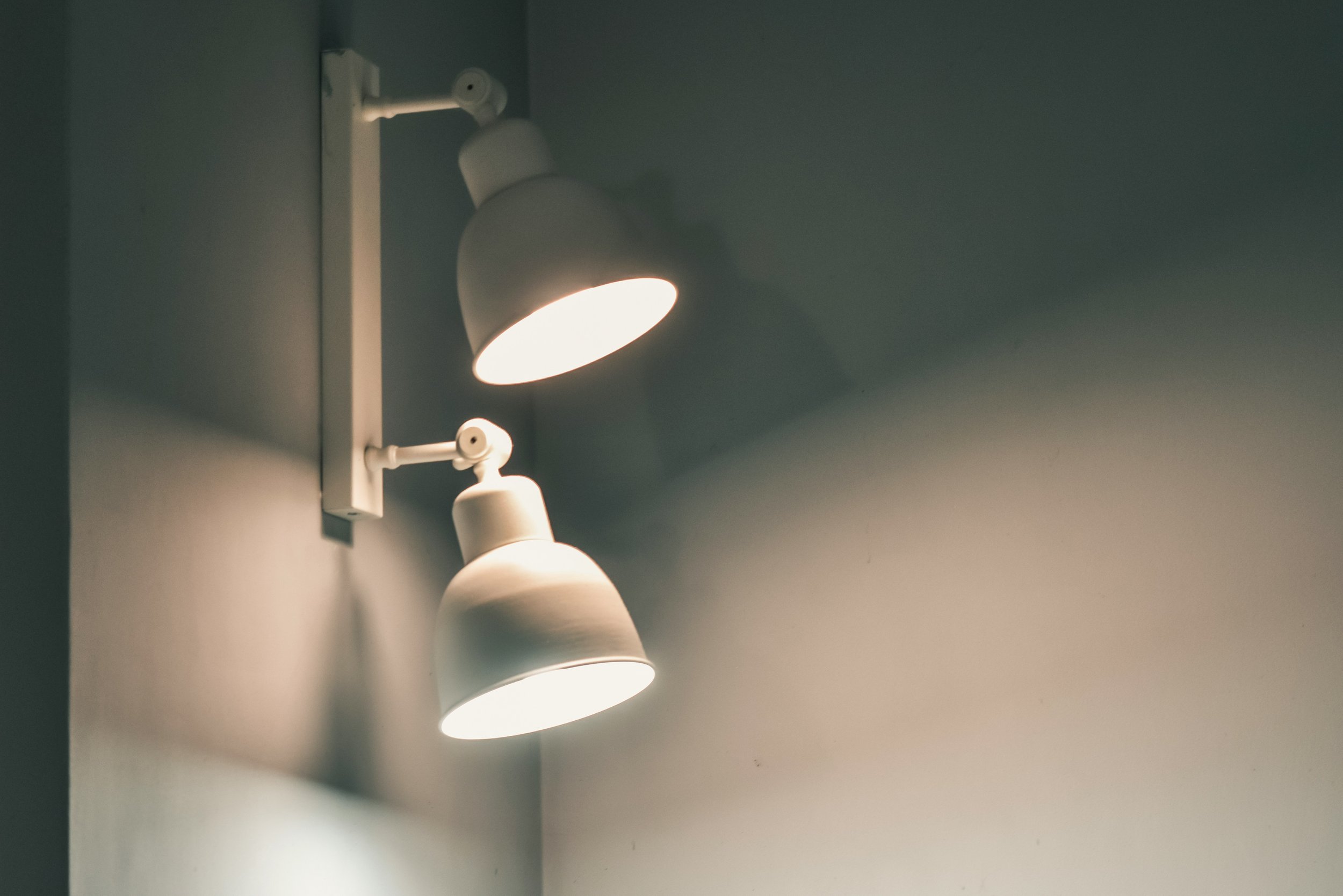
Lighting is one of those things retailers don't always think about until something feels wrong.
I've walked into plenty of stores where bright, cool general lighting floods everything equally. The store is technically well-lit, but it can feel cold and sterile and nothing in particular stands out.
Instead, think in layers.
You need comfortable general lighting so customers can see and move through the store, but directional lighting can help you emphasize a feature wall, mannequin, promotional table or new collection.
Your lighting should also suit what you're selling. The light someone needs while browsing packaged products isn't necessarily the same light you'd want around a fitting room mirror.
Good lighting helps establish atmosphere, but it can also quietly tell customers, look here.
5. Choose Materials and Fixtures That Support Your Brand
Your fixtures aren't simply somewhere to put merchandise. They're part of the visual language of your store.
Warm woods can create a completely different feeling from polished metal or glossy finishes. Colour, texture, shape and even the thickness of shelving contribute to how customers perceive the space.
Before buying fixtures, go back to your overall store concept. What should this space feel like?
Then consider function. What are you displaying? How much weight does the fixture need to support? Does merchandise hang, fold or sit on a shelf? Will you want to move the fixture later?
I always recommend working this way around: figure out what the store and merchandise need first, then choose the fixture. Don't buy something because it's beautiful and try to find a purpose for it afterward.
If sourcing cohesive fixtures is where you're getting stuck, our Curated Fixture Kits can help you narrow down the look.
6. Design for More Than Just What Customers See
Customers experience your store with more than their eyes.
Music, scent, temperature and even what customers are allowed to touch contribute to the atmosphere.
Your playlist should feel like an extension of your brand rather than a random collection of whatever happens to be popular. If you use fragrance, keep it subtle enough that it contributes to the space without becoming the thing customers notice most.
And where possible, let customers interact with your products. Shopping in person has one major advantage over shopping online: customers can pick something up, feel the material, see the true colour and experience it before buying.
Use those advantages.
7. Create Strong Focal Points
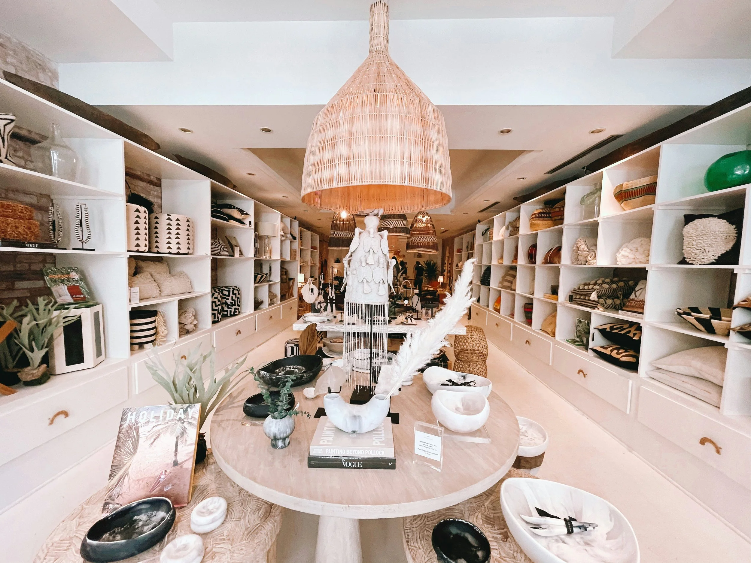
Every part of your store doesn't need to shout for attention.
In fact, when everything is competing to be noticed, nothing really wins.
Create a hierarchy by deciding which areas deserve the most visual emphasis. Your window may introduce the story. A feature display near the entrance can establish what's new. Another focal point deeper inside the store gives customers something to move toward.
You can create emphasis through lighting, colour, scale, signage, fixture placement or simply by giving an important product more space around it.
Then change those moments periodically. A display customers have walked past twelve times eventually becomes part of the background.
Your Store Should Work as One Experience
The interesting thing about these principles is that none of them really works alone.
You can create a beautiful display, but customers need to be able to find it. You can choose gorgeous fixtures, but they still need to work with your merchandise. And the perfect floor plan can still feel flat without lighting, personality and moments of discovery.
When you're evaluating your own store, don't only ask, Does this look good?
Walk through it like a customer.
Where does your eye go first? Is there something drawing you farther inside? Can you comfortably reach the merchandise? Do you understand where to go? Does the space feel like the brand you thought you were walking into?
Those questions will usually tell you much more about your store than whether everything simply matches.